Chris Jastrow is a dedicated UX designer and graphic artist based in Nashville, Tennessee, with a rich and diverse educational background. He holds a Bachelor's Degree in Graphic Design from Nossi College of Art and has pursued additional studies in Psychology at Middle Tennessee State University and Marketing at Lipscomb University, providing a strong foundation for understanding user behavior and experience. Chris is highly skilled in a range of Adobe programs, including Photoshop, Illustrator, InDesign, After Effects, XD, and Dimension, blending his design expertise with a focus on user-centered solutions. From developing intuitive user interfaces to crafting impactful logos and dynamic business cards, Chris applies his creative vision to projects across a variety of mediums. His experience extends to designing magazine ads, billboards, website banners, and album covers, always ensuring thoughtful, detail-oriented design. He also has a passion for digital and stop-motion animations, enhancing his versatile skill set as a designer.

LOGOS
/POSTERS
/ALBUM ART
/VIDEOS
/UX DESIGN

This logo was designed for fellow artist Anthony Jastrow's cartoon series drawing whimsical cartoons on instagram and selling his orignial designs here;RedBubble/People/Jastrow

This logo was designed for YouTuber Mickey Hale, who educates viewers on lawn care. The design features a lawnmower and his channel name encircled by a blade of grass, cleverly playing on his name to create a memorable brand identity. His channel can be found here;@OneHaleofaLawn

This logo creatively resembles a slice of cheesecake, capturing the essence of the brand's dessert offerings in a visually appealing manner.

This logo redesign was a student project aimed at enhancing an existing brand identity. The objective was to subtly incorporate piping elements to reflect the company's core purpose.
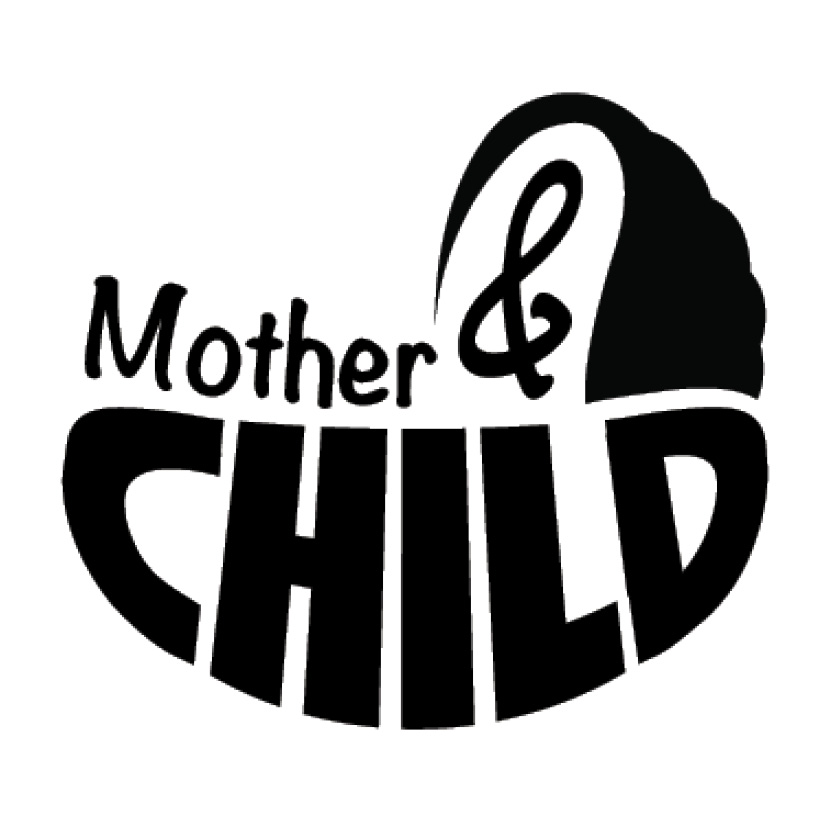
This logo was designed to showcase unity through similar letter forms arranged to form a cohesive and recognizable baby carriage shape. The close grouping of elements creates a unified and clear representation of the intended object.

This logo highlights the concepts of figure/ground and closure by using fragmented yellow lines to create the illusion of a yellow circle and a black lightning bolt. The viewer's mind completes the shapes, showcasing the power of implied forms.

This poster aims to encapsulate the essence of the movie with minimalistic design elements. The gritty texture and subtle gun shape in the character's right hand suggest the film's violent nature, while the empty dog leash subtly indicates the character's motivation.
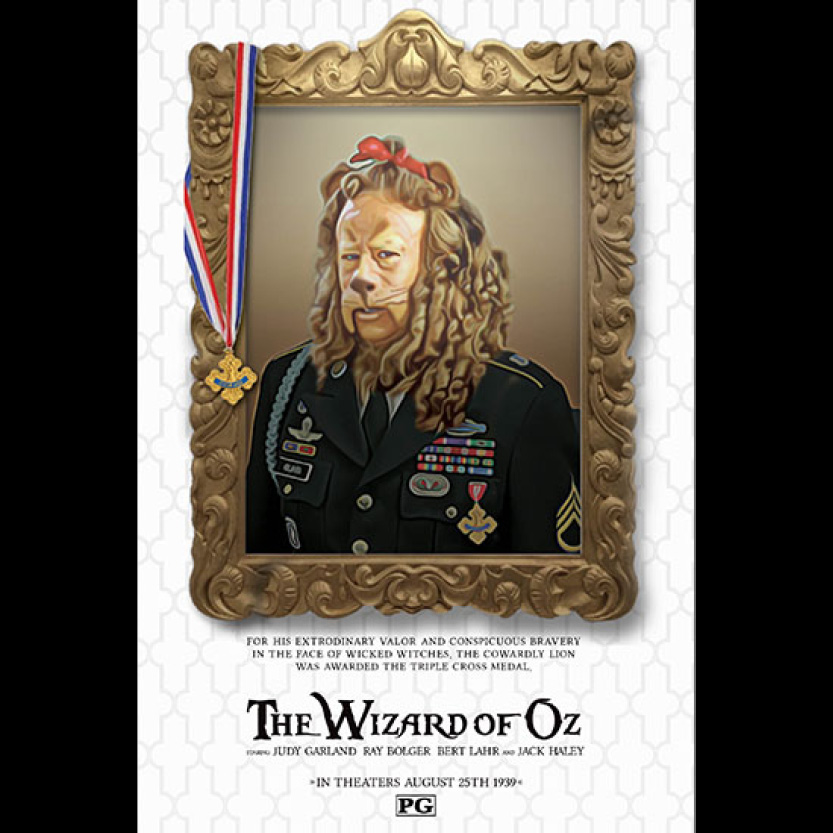
This three-part poster series is conceived as an introduction to "The Wizard of Oz" for a fresh audience. The framed portrayal of the lion, a brave and heroic figure, offers a nuanced irony, reflecting the character's initial timid demeanor while also alluding to his eventual growth and discovery of courage throughout the narrative arc.
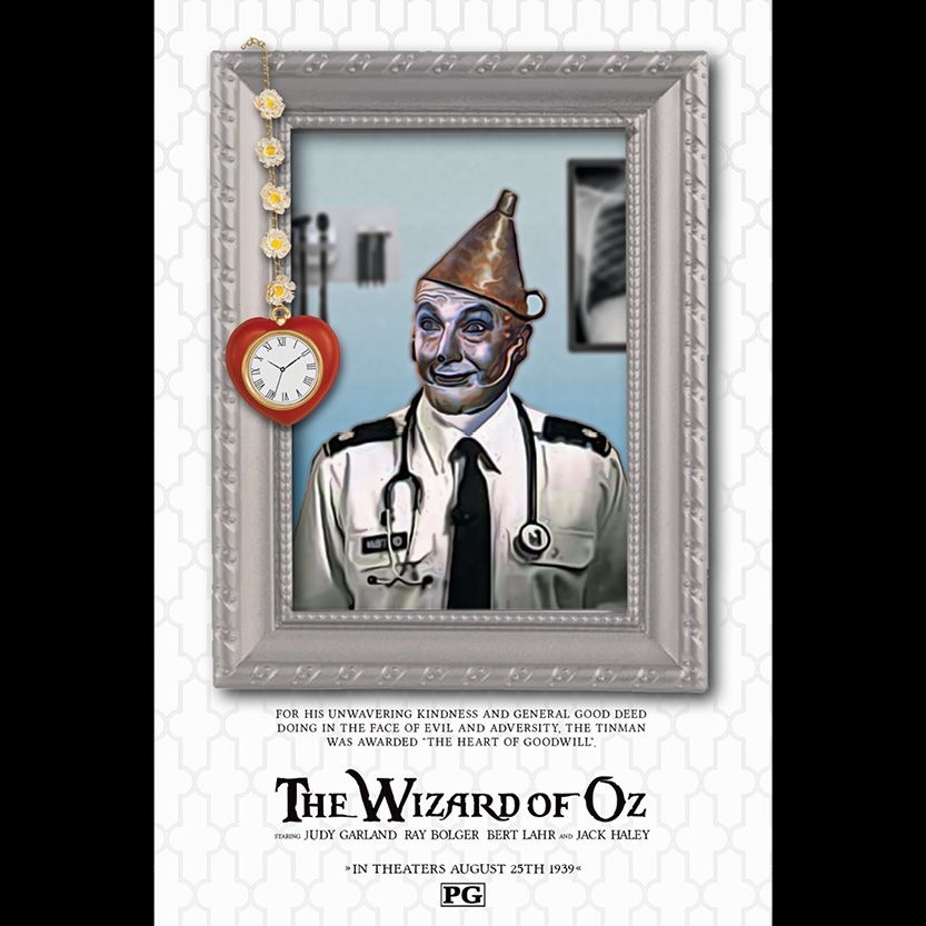
TThe second installment of this three-part series presents a poignant portrayal of the compassionate Tinman, highlighting his altruistic nature and unwavering dedication. Positioned as a military doctor, his depiction exudes pride, accentuating his "heart of goodwill" prominently displayed, symbolizing his commitment to serving others with kindness and empathy.
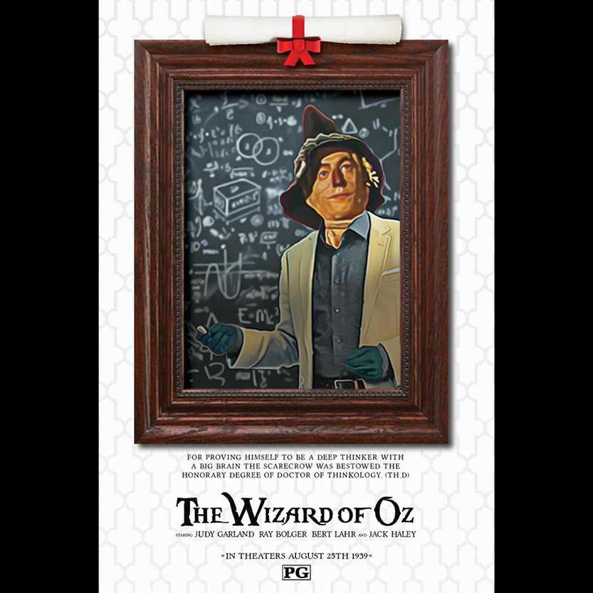
The final installment depicts the Scarecrow as a revered professor of "thinkology," intriguing unfamiliar audiences with its juxtaposition of appearance and role. This contradiction becomes meaningful upon viewing the film, revealing the character's journey and transformation.

This Scotch whiskey poster showcases meticulous craftsmanship using Adobe Illustrator, with every element meticulously rendered in vector format. From the picturesque sunset to the intricately detailed glass and ice cubes, each component is fully scalable, ensuring optimal quality at any size.

This Tic Tac poster exemplifies cutting-edge design techniques, crafted using Modo 3D software and supplemented with strategic use of Photoshop. The product, meticulously rendered in three dimensions, allows for dynamic manipulation and viewing from various angles, showcasing versatility and attention to detail.
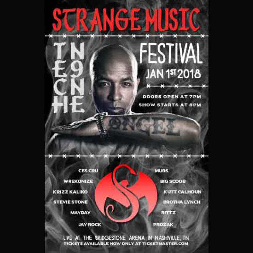
This captivating poster promotes a fictional music festival with a dynamic blend of fiery imagery and edgy elements like barbed wire, evoking excitement and anticipation. The circular arrangement of the artist lineup draws focus to the festival's music label logo at its center, creating a visually compelling centerpiece that commands attention.

This movie poster centers on the enigmatic character V, utilizing V-shaped fireworks to accentuate his presence while subtly hinting at the explosive and tumultuous themes within the film. The uniformed crowd, adorned with identical masks, symbolizes V's mission to unite individuals against governmental oppression, encapsulating the film's underlying message of solidarity and resistance.
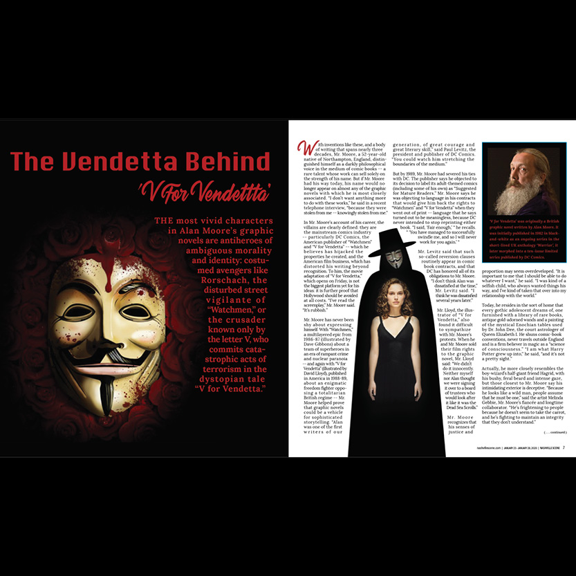
This magazine article layout showcases my proficiency in arranging text and images to captivate readers. The inclusion of a bloody mask alludes to the film's themes of violence and mortality, while the juxtaposition of the main character, portrayed by Natalie Portman, within the shadow of the antihero V, adds depth and intrigue. Additionally, featuring the graphic novel's author in the corner with an insert about the film's origin adds contextual richness to the overall design.

Continuing the article, the inclusion of V's iconic blade emphasizes the character's symbolic power and defiance, while the depiction of his devoted followers on the right side underscores the impact of his revolutionary message. Above the crowd, the graffiti, a recurring motif from the film, glorifies V as the people's enigmatic and morally ambiguous hero, adding depth to the narrative and reinforcing the film's thematic resonance.

The inaugural design for Matt Begley's singles release series captures the essence of his country music with a picturesque sunset backdrop. The inclusion of a "waving" windmill and gently swaying trees not only aligns with the song's title but also imbues the scene with a sense of rustic charm and tranquility.Matt Begley on YouTube Music

The second design in Matt Begley's singles release series cleverly incorporates imagery that resonates with the song's theme of signing contracts. The dotted line surrounding the title evokes the act of signing, while the radiant sunrise illuminates the scene, subtly hinting at a dotted line on a country road, reinforcing the lyrical narrative with visual symbolism.
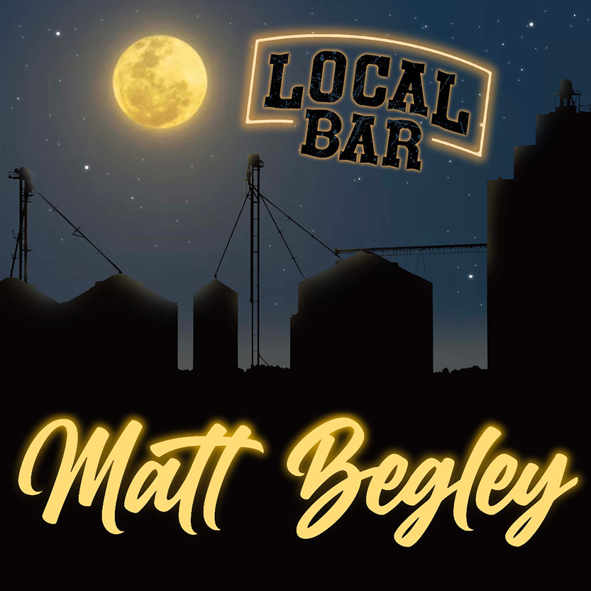
The third design in the series captures the essence of a night out at a local bar with its atmospheric night scene. The luminous glow of the sign mirrors the ambiance of a neon sign one might encounter in such establishments, setting the stage for the song's theme and creating a visually compelling connection to the nightlife experience.

This album cover for Soft Carnage, a fictional band, combines cartoon characters akin to Gorillaz with dark elements like blood splatter and demonic figures. This playful yet edgy aesthetic captures the band's hardcore vibe while inviting listeners into their unique world.

This CD insert design for Soft Carnage's album builds on the edgy aesthetic established in the album cover. Featuring additional panels for the back and sides of the CD case, it maintains the same dark yet playful vibe, ensuring a cohesive and visually striking presentation for fans to enjoy alongside the music.

Inside the CD case, the left side presents a brief band introduction, while the right side showcases a creatively designed CD featuring the album name. This dual layout provides a succinct yet engaging presentation of Soft Carnage's music and branding.
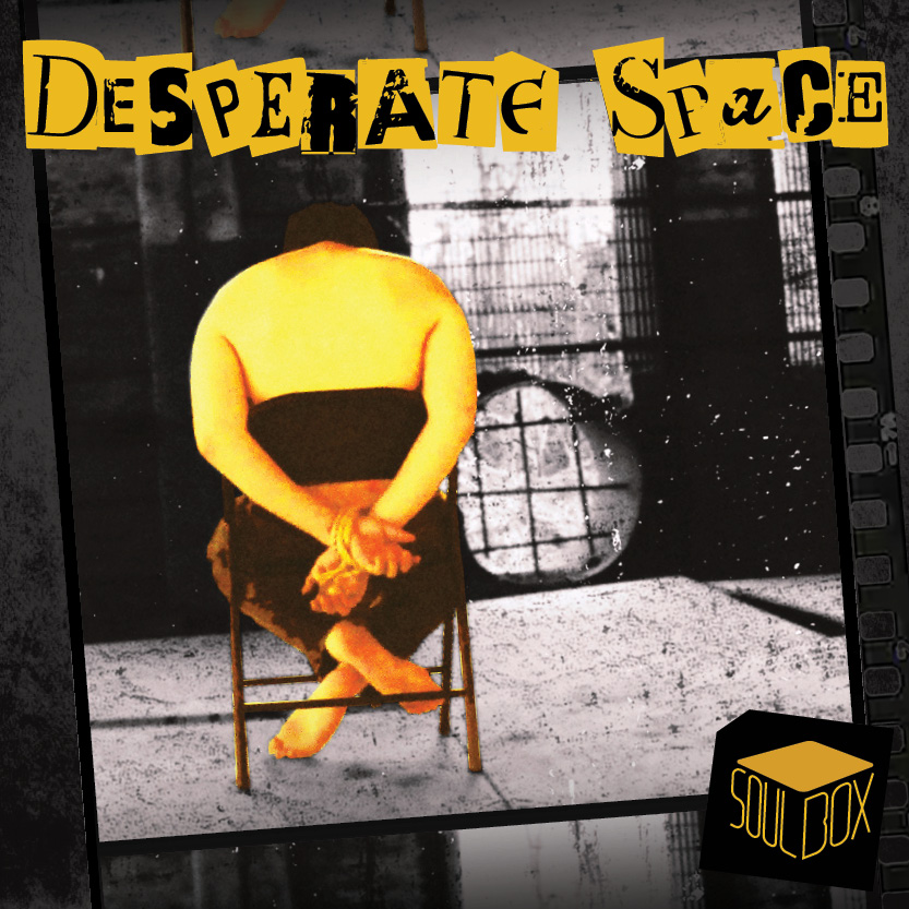
This album design, crafted as part of a comprehensive marketing package for a fictional release, adopts a colorless and rough aesthetic, strategically utilizing empty space to accentuate the album's title. This deliberate choice in imagery creates a compelling visual narrative that resonates with the thematic essence of the music, offering a captivating glimpse into the album's tone and atmosphere.
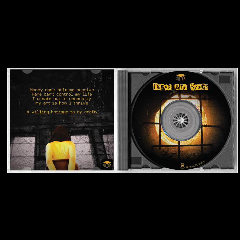
Continuing the project, the inside panel and CD art maintain the thematic coherence established in the album design. The inside panel features additional artwork and information, while the CD art further reinforces the album's title and concept, ensuring a cohesive and immersive experience for listeners.
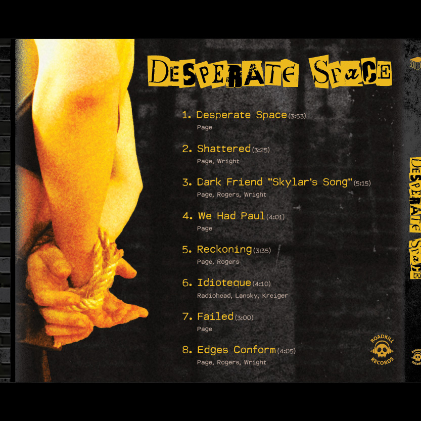
On the back and side panel of the CD case, the song list is prominently displayed, offering a glimpse into the album's track lineup. This essential information ensures that listeners can easily navigate the contents of the album while maintaining the overall aesthetic continuity of the design.

As an integral part of the project, this poster serves as a dynamic advertisement for the tour dates and locations associated with the album release. Additionally, a teaser video crafted specifically for this project can be accessed under the "videos" tab, offering audiences a tantalizing glimpse into the tour experience.
This stop-motion animation is a testament to creativity, crafted by meticulously moving cut-out paper pieces on a tabletop and capturing them from above. With Adobe After Effects, these images were seamlessly layered together to bring the scenes to life. Furthermore, the digital animation of the enchanting "magic" was meticulously rendered using Adobe Photoshop, adding an extra layer of depth and visual intrigue to the final product.
This stop-motion animation and logo were skillfully crafted as a banner ad for a class project promoting a children's toy. The playful animation and inviting logo capture the essence of fun and imagination, engaging young audiences with the product.
This video serves as a teaser for a fictional album release project, offering a glimpse into the artistic vision behind the music. For further exploration, the album itself can be found under the "Album Art" tab, providing a comprehensive experience for viewers to immerse themselves in the project.
This whimsical animation was created purely for enjoyment while experimenting with a new animation technique.
Below are interative UX Design prototypes with internal menus that can be navigated by clicking or tapping on the images.
This travel app concept shows users local attractions, hotels, car rentals, and even weather reports for any popular area they wish to travel. By signing up to become a member users gain access to special discounts and recommendation notifications based on individual user preference.
This Mental Clarity app concept helps users manage stress, track their mood, and engage in mindfulness exercises to improve their mental well-being. By signing up for an account, users gain access to personalized relaxation techniques, progress tracking, and daily reminders tailored to their unique needs and mental health goals.
Interested in hiring JastrowDesigns for freelance or full time work?Reach out by email and let's get started today! SEND EMAIL